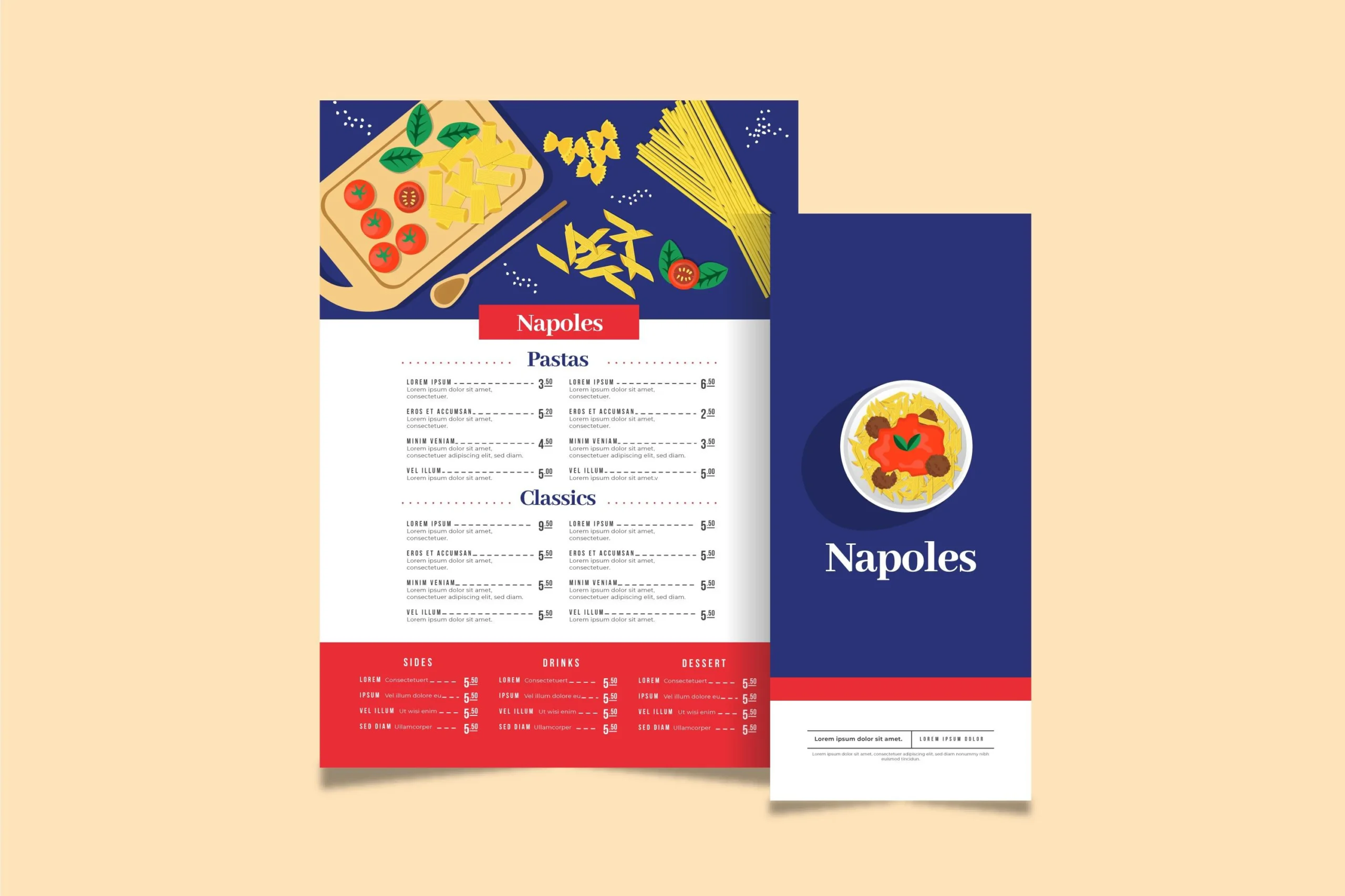
In the fast-paced world of restaurants, menus play a critical role beyond simply listing dishes. They act as silent salespeople, enticing patrons, guiding their decisions, and ultimately influencing their dining experience. However, a poorly designed menu can backfire, leaving customers confused and frustrated. Here’s where menu printing best practices come to the rescue!
By incorporating these ten essential tips, you can craft menus that are not only easy to navigate but also visually appealing and effective in driving sales.
1. Prioritize Readability: A Crystal-Clear First Impression
Readability is the cornerstone of any successful menu. Ensure your chosen fonts are large, clear, and easy on the eyes, even for patrons with less-than-perfect vision. Avoid overly decorative or script-like fonts that can be difficult to decipher, especially under dim lighting conditions. Additionally, leave ample space between sections, descriptions, and pricing to avoid a cluttered and overwhelming appearance.
2. Embrace Organization: A Well-Structured Guide
Imagine a bustling restaurant with hungry patrons eager to explore your culinary offerings. A well-organized menu acts as their guide, making navigation a breeze. Utilize clear headings to categorize different food groups (appetizers, entrees, desserts) and employ subheadings for further distinction (vegetarian options, seafood selections). Employ bullet points to list ingredients within descriptions, ensuring clarity and allowing patrons with dietary restrictions to quickly identify suitable choices.
3. Descriptive Language: Words that Sizzle and Sell
Move beyond dry, one-word descriptions. Instead, paint a picture on the plate with vivid language that ignites the senses. Use descriptive words that evoke the flavors, textures, and aromas of each dish. For example, instead of simply stating “Grilled Salmon,” consider something like “Pan-Seared Atlantic Salmon glazed with a citrus-herb dressing, served on a bed of roasted seasonal vegetables.” This approach entices customers and encourages them to explore menu items they might otherwise have overlooked.
4. Highlight the Stars: Showcase Signature Specialties
Every restaurant has a few signature dishes or seasonal specialties that deserve extra attention. Don’t be shy about showcasing these culinary creations! Utilize boxed features or slightly larger fonts to draw focus to these standout items. You can even incorporate high-quality photographs (if your menu design allows) to further tempt patrons and showcase the visual appeal of your dishes.
5. Find the Balance: Information Meets Visual Appeal
A well-designed menu strikes a perfect balance between informative text and visual appeal. Consider implementing a consistent color scheme that complements your restaurant’s branding. While high-quality photographs can be incredibly effective, ensure they are professionally taken and well-integrated into the overall design. Remember, the menu’s primary function is communication – don’t let visuals overwhelm crucial information.
6. Size Matters: Finding the Right Fit for Your Restaurant
There’s no one-size-fits-all approach to menu size. A small bistro with a limited menu might function perfectly with a single-page design. Conversely, a large, family-friendly restaurant with a diverse offering may require a more extensive, multi-page layout. Consider your restaurant’s type, menu complexity, and customer flow to determine the optimal size that ensures user-friendliness and avoids overwhelming patrons.
7. Proofreading is Paramount: Maintain Professionalism
Typos, grammatical errors, and inconsistencies can create a sloppy and unprofessional impression. Before sending your menu to print, meticulously proofread it yourself and enlist the help of a colleague or professional editor for an extra layer of assurance. A menu riddled with errors can undermine customer confidence and negatively impact the overall dining experience.
8. Material Matters: Durability and Sustainability
The paper you choose for your menu plays a significant role in both aesthetics and functionality. Opt for high-quality, durable paper that can withstand frequent handling and spills. Laminated menus are a practical choice for high-traffic areas, while restaurants focused on eco-friendliness might consider recycled or sustainably sourced paper options.
9. Embrace Digital Menus: A Modern Approach (Optional)
In today’s digital age, consider offering a digital menu alongside your printed version. This allows for easy updates, showcases high-resolution food photography, and can cater to patrons with accessibility needs. QR codes strategically placed around your restaurant can seamlessly connect customers to the digital menu on their smartphones.
10. Track and Adapt: Monitor Menu Performance
Don’t consider your menu a static document. Regularly analyze sales data to see which dishes are the most popular and which ones might need revamping. Pay attention to customer feedback, both positive and negative, to identify areas for improvement. By tracking menu performance and adapting based on data and feedback, you can ensure your menu remains not only visually appealing but also strategically optimized to maximize revenue by using Menu Printing Best Practices.


