NCR forms, those nifty multi-ply wonders, are the workhorses of many businesses. From receipts to invoices, purchase orders to repair slips, they keep track of transactions and information seamlessly. But a poorly designed NCR form can create confusion and frustration, slowing down processes and causing errors.
Fear not, fellow form fans! This blog post is here to equip you with the best design tips for effective NCR forms. By following these guidelines, you can create clear, efficient, and user-friendly forms that make everyone’s life easier.
Planning Makes Perfect: Laying the Foundation for Success
Before you dive headfirst into design software, take a step back and consider these crucial planning points:
- Identify Your Needs: What information needs to be captured on the form? Who will be using it (employees, customers, both)? How will the completed forms be used (internally, for customers, both)?
- Simplify: Resist the urge to cram everything onto one form. Break down complex processes into multiple forms if necessary. Keeping things clear and concise is key to avoiding errors.
- Define the Flow: How will the form be filled out? Does information need to flow logically from one section to the next?
Designing for Clarity:
Now that you have a clear plan, let’s get down to the nitty-gritty of design:
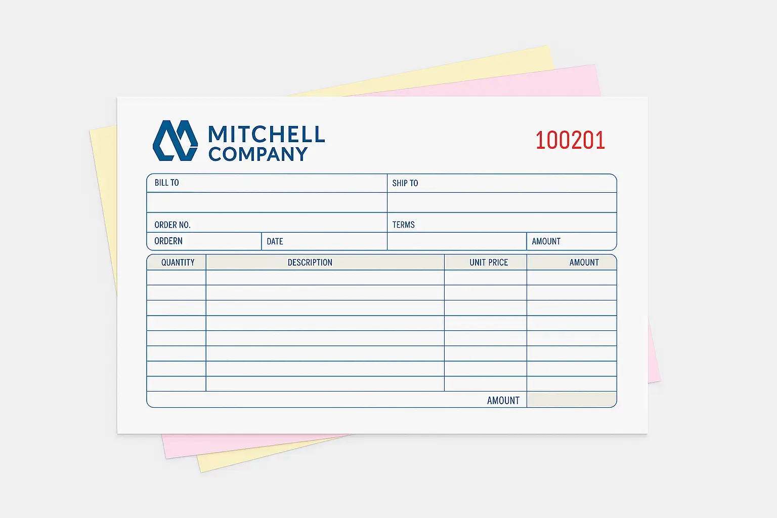
- Embrace the Grid: A well-structured grid system helps organize your NCR form’s layout. Imagine the form as a table with rows and columns, ensuring consistent spacing and alignment for all elements.
- Bold Headings and Labels: Use clear, concise headings and labels in a bold font that stands out from the body text. This makes it easy for users to find specific information quickly.
- Consistent Formatting: Maintain consistency throughout the form. Use the same font size and style for all labels and instructions. This promotes a professional look and avoids confusion.
- Boxed-In Goodness: Utilize boxes or lines to clearly define sections and areas where information needs to be filled in. This guides users and helps prevent messy handwriting from overlapping important details.
Optimizing for NCR Magic:
NCR forms come with the magic of transferring information across multiple sheets. Here’s how to design with that in mind:
- Alignment is Key: Ensure all corresponding fields on each ply (copy) of the form line up perfectly. This is crucial for ensuring the information transfers legibly. Many design software programs have alignment tools to help with this.
- Color Coordination: While a splash of color can add visual interest, use it strategically. Avoid colors that might not transfer well across all plies. Opt for bold black or dark blue for important text fields that need to be clear on all copies.
- Less is More: NCR paper can sometimes become cluttered if there’s too much information. Avoid printing heavy backgrounds or graphics on NCR copies, as they might interfere with the transfer process.
Bonus Tips:
- Proofread, Proofread, Proofread! Typos and errors can be costly. Double (or triple) check your form for accuracy before printing.
- Version Control: Include a version number on your form to track revisions and avoid confusion if updates are made.
- Instructional Magic: Consider adding clear instructions at the top of the form, especially if the form is complex or has specific requirements for completion.
By following these best design tips for effective NCR forms, you can create forms that are not only functional but also a pleasure to use. Clear communication, efficient design, and a touch of planning will ensure your NCR forms become champions of organization, not chaos, in your business!


