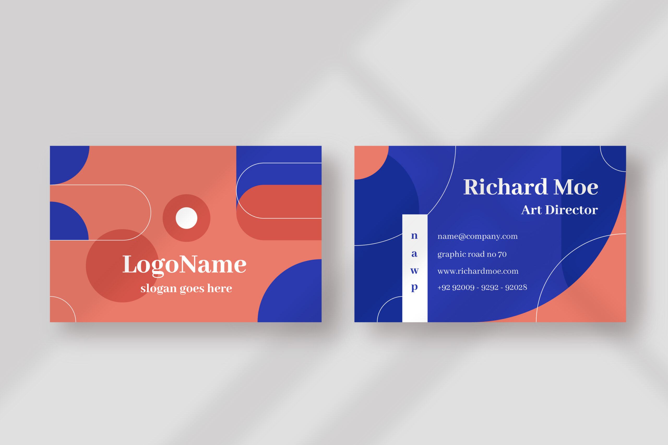
In today’s fast-paced world, where information overload is a constant struggle, simplicity reigns supreme. This is especially true when it comes to business cards. A well-designed business card is a powerful tool for making a lasting first impression. But with so many competing designs vying for attention, how can you ensure your card stands out? Enter the minimalist business card design, a trend taking the business world by storm.
What is Minimalist Design?
Imagine a clean, uncluttered space. Now, picture a business card that reflects that same sense of order and clarity. That’s the essence of minimalist design. It focuses on using the fewest possible elements to create a visually appealing and informative card. Think clean lines, ample white space, a limited color palette, and a focus on essential information.
Why Choose Minimalist Design for Your Business Cards?
Don’t be fooled by its simplicity – minimalist design packs a powerful punch. Here’s why you should consider it for your next batch of business cards:
- Makes a Bold Statement: In a sea of cluttered cards, a minimalist design stands out. It grabs attention and conveys a sense of confidence and sophistication. It’s like saying, “We know what we’re doing, and we don’t need bells and whistles to get our message across.”
- Enhances Clarity: A minimalist card prioritizes essential information like your name, title, company logo, contact details, and maybe a website URL. This makes it easy for potential clients and collaborators to find what they need quickly and easily. No more deciphering tiny text or trying to figure out what a busy graphic means.
- Creates a Memorable Impression: Less is often more when it comes to creating a lasting memory. A clean, well-designed card is more likely to be remembered than a cluttered one. Imagine someone flipping through a stack of business cards after a networking event. The minimalist card with the crisp logo and clear contact details is the one that will likely jump out.
- Projects Professionalism: Minimalist design exudes an air of professionalism and competence. It shows that you value clarity, organization, and attention to detail. These are all qualities that potential clients and partners look for in a business.
- Versatile and Timeless: Unlike trendy designs that can become outdated quickly, minimalist cards have a timeless quality. They won’t look out of place years down the line. Plus, the simplicity allows for more flexibility in terms of color palettes and materials, making it easier to adapt the design to your brand identity.
- Cost-Effective: Since minimalist designs typically use fewer colors and graphic elements, they can be more cost-effective to print compared to their more elaborate counterparts. This is especially beneficial for small businesses or startups looking to save on printing costs.
Tips for Creating Effective Minimalist Business Cards:
- Focus on High-Quality Materials: A minimalist design relies heavily on the quality of the materials used. Opt for thick, luxurious cardstock that feels good to the touch. This will elevate the overall look and feel of your card.
- Choose a Strong Logo: Your logo is often the first thing people will notice on your business card. In a minimalist design, it takes center stage. Ensure your logo is clean, well-designed, and reflects your brand identity.
- Select Readable Fonts: With fewer elements to grab attention, the font you choose becomes even more important. Pick clear, easy-to-read fonts that complement your logo and brand personality. Sans-serif fonts are generally a safe bet for minimalist designs.
- Embrace White Space: Don’t be afraid of empty space! It’s not wasted space; it’s a deliberate design choice that creates a sense of balance and allows the other elements on your card to breathe.
- Keep it Simple: When in doubt, leave it out. Resist the urge to add unnecessary elements like cutesy graphics or distracting patterns. Remember, the goal is to keep it clean and focused.
Examples of Minimalist Business Card Design:
A quick online search will reveal a treasure trove of minimalist business card inspiration. You’ll find cards with bold, single-color backgrounds featuring a clean logo and contact details. Others might use a subtle texture or metallic foil for a touch of elegance. The key is to find a design that reflects your personal style and brand identity.
The Bottom Line
In a world of clutter and noise, minimalist design offers a refreshing alternative. By embracing simplicity, you can create a business card that makes a powerful statement and leaves a lasting impression. So, ditch the busy designs and consider the striking impact of minimalist design for your next batch of business cards. You won’t be disappointed!


